Announcement

Collapse
No announcement yet.

New Kit

Collapse
X
 
  • Filter
  • Time
  • Show
Clear All
new posts

    #16
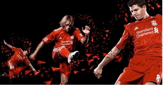
    The red with the white collar is double ****, looks like the British Lions rugby kit.

    Comment


      #17
      Originally posted by el matador View Post
      from what i hear the top one is genuine.

      The other 2 kits are the prem away which is a white top with red stripes, it has a red and black v neck design. The euro away is a black with yellow stripe top.

      The white prem top is amazing. Ive got pics but i dont know how to upload.
      [ATTACH]1125[/ATTACH]

      This one?
      Last edited by cream; 29-04-13, 09:53 AM.
      Brandt - Keita - Van Dijk - Sessegnon

      Comment


        #18
        Too much ****ing GREEN!!!!!!!!!!!! Urgggggggghhhhhhhhhh!!!!!!!!!!

        Would have been so much nicer if the sponsor and adidas logo were in red.
        "Its not about the long ball or the short ball, its about the right ball." Bob Paisley

        Comment


          #19
          Originally posted by Tee View Post
          Too much ****ing GREEN!!!!!!!!!!!! Urgggggggghhhhhhhhhh!!!!!!!!!!

          Would have been so much nicer if the sponsor was in red.
          And for me....the swirly logo thing at the end of Standard Chartered is clashing with the lfc badge imo.....too much going on there for me...looks cluttered, the ad should be a lot smaller.
          Last edited by Vermilion; 01-04-10, 12:51 PM.

          Comment


            #20
            The All black look is pretty awesome, We just need a plain Liver Bird badge. Thats it just a shame its not the real thing and a cover up

            Comment


              #21
              The gold one looks decent, dont mind any of them tbh there are a lot of other kits going around that are far worse.

              Comment


                #22
                The second shirt is naff, **** collar on it...looks like an old fashioned rugby shirt..

                Comment


                  #23
                  wouldn't mind the white/green one brings back memories of robbie
                  Vive la France

                  Comment


                    #24
                    Originally posted by cream View Post
                    [ATTACH]1125[/ATTACH]

                    This one?
                    thats the one mate.

                    Id prefer the standard logo in red or black but other than that the kit looks pretty good. Out of all three, thats the one id go for.
                    [B]Sir Isaac Newton knew the universal law of karma - any action has its equal and opposite reaction.[B]

                    Comment


                      #25
                      A couple of new pics, I reckon it must be this one as the design is shown above and have seen it various times, looks smart.


                      Comment


                        #26
                        Why are the stripes on the shoulder/sleeve broken? Hate it. If they were continuous it's look much better.

                        Otherwise I like it although I can't get used to the new sponsor.
                        Thanks very much for being ‘This Mornings’ Farmer’

                        Comment


                          #27
                          Yeah, not bad.
                          Trey Nyoni: countdown to stardom- 2 years 1year 0.5 years

                          Comment


                            #28
                            Originally posted by Shaggy View Post
                            Why are the stripes on the shoulder/sleeve broken? Hate it. If they were continuous it's look much better.

                            Otherwise I like it although I can't get used to the new sponsor.
                            Yh I suppose, but adding the badges there I guess it wouldn't look so bad, and never has our sponsor been so apt, other teams fans are going to have a field day...

                            Comment


                              #29
                              Originally posted by Shaggy View Post
                              Why are the stripes on the shoulder/sleeve broken? Hate it. If they were continuous it's look much better.

                              Otherwise I like it although I can't get used to the new sponsor.
                              It's odd isn't it! We have had Carlsberg for so long.

                              The broken stripes will be less obvious because of all the badges on the sleeves tbf.
                              www.Liverpoolbaymlt.org

                              www.twitter.com/lbmlt

                              www.Facebook.com/liverpoolbaymarinelifetrust

                              Comment


                                #30
                                Originally posted by Shaggy View Post
                                Why are the stripes on the shoulder/sleeve broken? Hate it. If they were continuous it's look much better.
                                Yeah I've never really liked that either, but then I guess there would always be either Premier League or European badges there anyway.

                                Comment

                                Working...
                                X